
discover free food photography
courses instead
Now available on Youtube @foodphotocircle
you instructors
YOUR TEACHERS' WORK AS SEEN IN

-
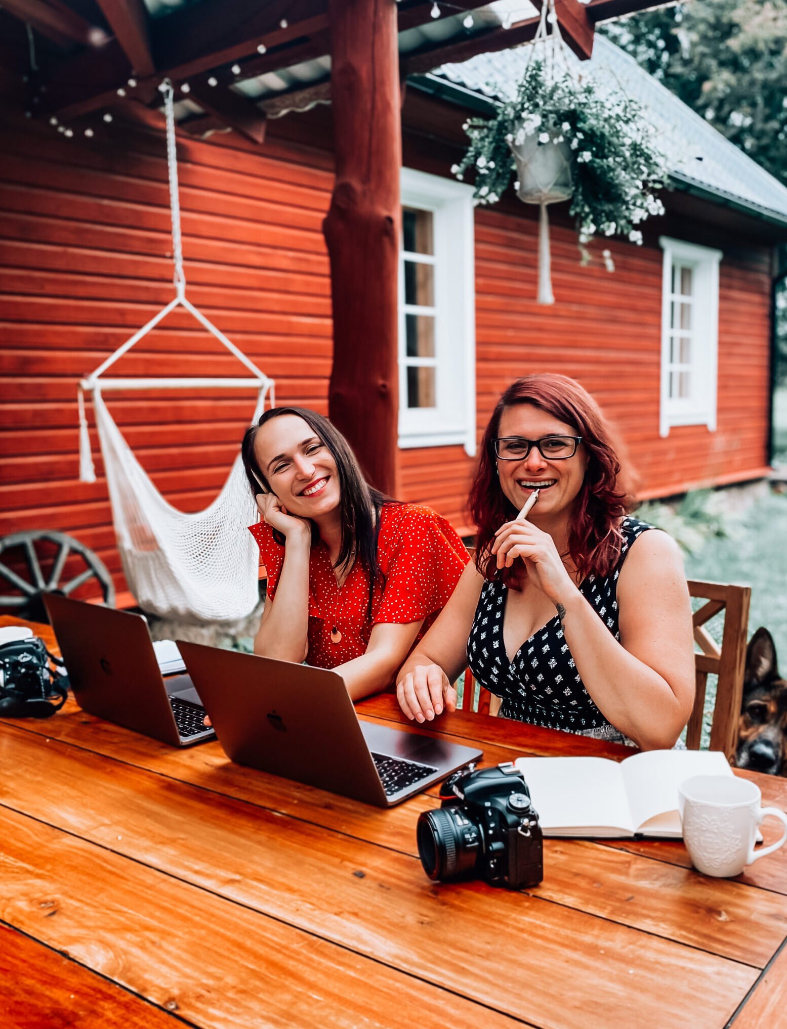
“Hey! I’m Laura and usually you can find me in the kitchen baking or in the forest or garden exploring and collecting new ingredients! I have a masters degree in law but I decided to become a professional photographer. Before I realised it, I got international recognition on my photography, I published photography eBooks & I started teaching photography to others!”
-
“Ciao! I’m Giulia, I’ve been a professional food photographer for the past 10 years. I have worked with big advertising and commercial clients as well as food brands, restaurants and magazines. My background is in teaching so I mentor photographers of all levels. I am passionate about sharing knowledge and helping my students unleash their full potential!”

video course
FREE
Food Photography 101 + Editing
Courses on Youtube
video courses + live sessions
PHOTOGRAPHY BUSINESS
Online Course + Private mentoring